In a corporate presentation, motion graphics are not decoration — they direct attention, make data legible, and make a brand look credible. Used with restraint, they are the difference between a deck people sit through and one they actually act on. But corporate work has its own rules: the motion has to serve clarity, survive endless client revisions, and stay rigorously on-brand. Here are seven techniques that consistently land in corporate video, how to use each one well, and the fastest way to build it.
Why motion graphics earn their place in corporate video
Executives and clients are busy and a little skeptical, and a wall of static bullet points loses them fast. Motion does three things a static slide cannot. It directs the eye to the one number that matters instead of leaving the audience to find it. It paces information so people absorb one idea at a time rather than reading ahead. And it signals production value that reflects directly on the brand. The catch is that the same tools, overused, do the exact opposite — they distract, slow the message, and read as amateur. Every technique below is about capturing the upside without the downside, which in corporate work almost always means doing less, but doing it cleanly.
What corporate clients actually notice
Before the techniques, it helps to know who you are really making this for. Two audiences judge corporate motion graphics, and they notice different things. The brand team notices precision — is the logo blue exactly right, are the fonts correct, does every slide feel like the same company? Get that wrong and the work reads as careless no matter how slick the animation. The executives and clients in the room notice clarity and confidence — can they follow the data, does it look expensive, does it respect their time?
Neither audience is impressed by motion for its own sake. They are impressed by a presentation that looks considered, stays on-brand, and makes the message effortless to follow. Keep both in mind and every choice below gets easier: when in doubt, favor the option that is cleaner, more consistent, and faster to read.
1. Titles and text that survive client revisions
Corporate decks are full of text — speaker names, job titles, section headers, legal lines, disclaimers — and corporate clients change it constantly. A name is misspelled, a VP gets a new title, legal rewords a sentence, and suddenly you are hunting through dozens of compositions to fix it. Multiply that by the multiple language versions a global client expects, and manual text management quietly eats your week.
The fix is to treat text as data you manage, not graphics you rebuild. Keep titles consistent — the same font, size, motion, and timing every time — and animate the first impression, then hold. TextPilot is built for exactly this: scan every text layer in the project, edit and find-and-replace in bulk, translate into multiple languages, and audit fonts and colors so a brand update applies everywhere — all from one panel. The fortieth revision takes minutes instead of hours, and every language version stays in sync. That is the difference between dreading client notes and turning them around the same afternoon.
2. Kinetic typography — for one key message
Animating your single most important line — a stat, a promise, a tagline — makes it stick. A figure that builds on screen, or a phrase that arrives word by word, earns a beat of attention that a static line never gets. The mistake is animating everything; when every word moves, nothing stands out, and the effect tips from polished to busy. Pick the one moment in the presentation that has to land and reserve kinetic typography for it. We break down when motion helps versus hurts in the role of text animation in viewer engagement, but the corporate rule of thumb is simple: one hero line per section, clean entrance, then let it sit.
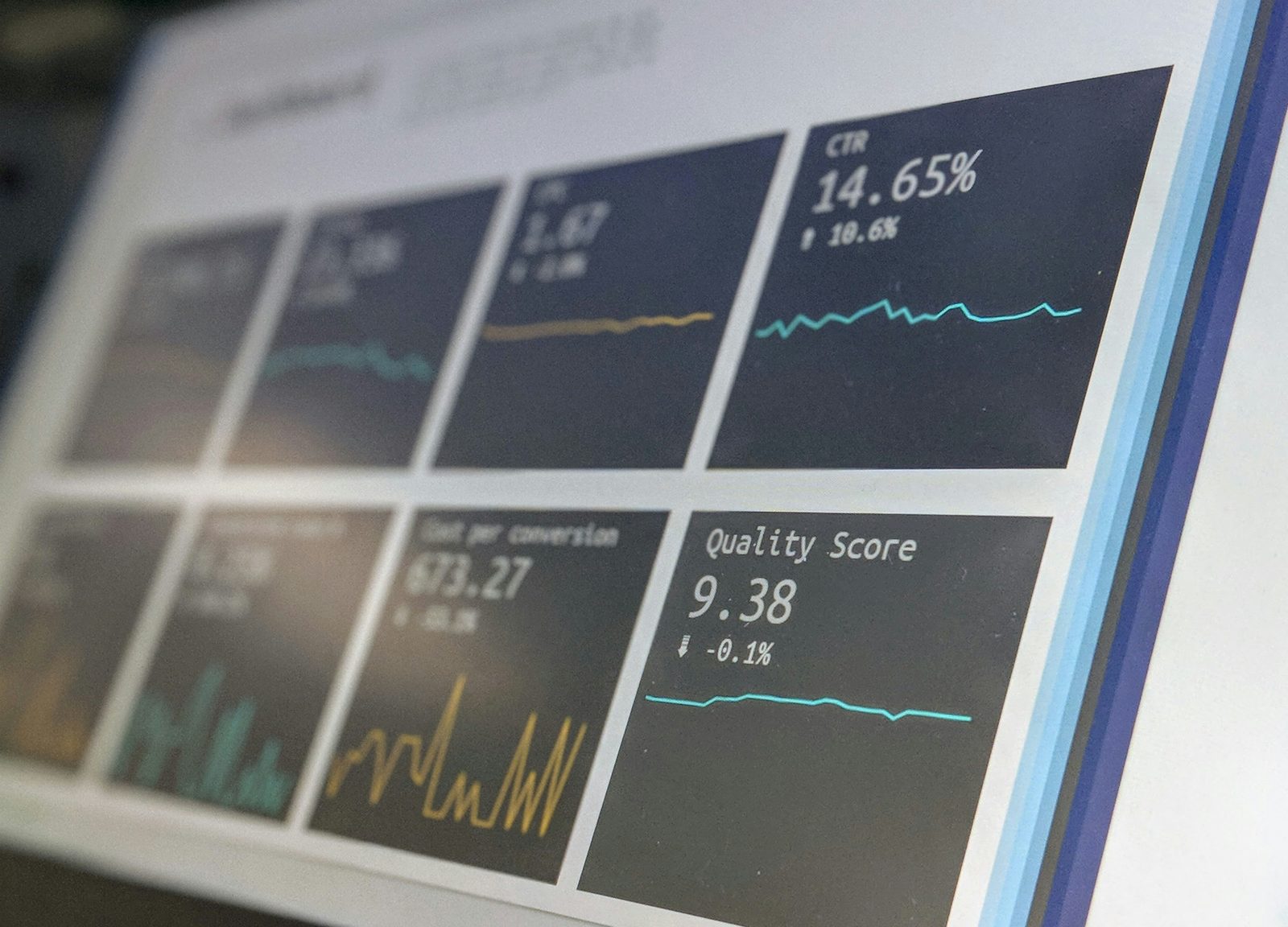
3. Animated data and charts
Numbers are where corporate decks win or lose trust, and a chart that simply appears all at once asks the audience to decode it while you talk. Reveal data progressively instead — one bar grows, then the next; a line draws across the quarters; the key figure counts up and holds. The progressive build turns a static chart into a small story the audience follows with you, and it lets you control exactly when the punchline number lands.
Two rules keep it credible: keep it accurate (no truncated axes or cherry-picked scales), and keep it uncluttered (one idea per chart, labels the audience can read from the back of the room). The animation should clarify the data, never dress it up.
4. Callouts and annotations
When you need to highlight a product feature, a line in a UI, a region on a map, or a single figure in a dense slide, an animated callout line or label guides the eye instantly — far better than asking people to find "the number in the top right." Callouts are the workhorse of explainer and product-walkthrough sections, and the key is restraint: one or two on screen at a time, drawn in cleanly, removed when you move on. Build them in one click with CallOuts instead of hand-keyframing lines and labels for every revision.
5. Clean, consistent transitions
Corporate does not mean boring, but it does mean controlled. Subtle, consistent transitions between sections keep a presentation moving and signal structure — "we are changing topics now" — without the cheese of spinning cubes or page peels. Pick two or three transitions and use them consistently across the whole deck; consistency is what reads as intentional. A drag-and-drop pack like Transitions keeps the look cohesive and saves you from rebuilding the same wipe a dozen times. When in doubt, a clean cut or a quick dissolve beats a flashy transition every time.
6. On-brand color, every frame
Nothing undermines a corporate video faster than off-brand color — a logo blue that is slightly wrong, an accent that drifts between scenes. Consistency is credibility here, because the brand team will notice immediately. Lock your palette to the brand's exact hex values up front and apply it everywhere: titles, charts, callouts, lower thirds. The hard part is updating it when the client tweaks a shade late in the project. ColorMaster centralizes every color in the project so a brand change propagates in seconds instead of forcing you to dig through every comp by hand.
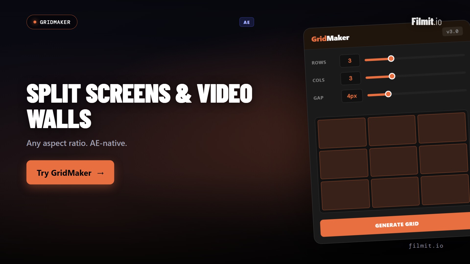
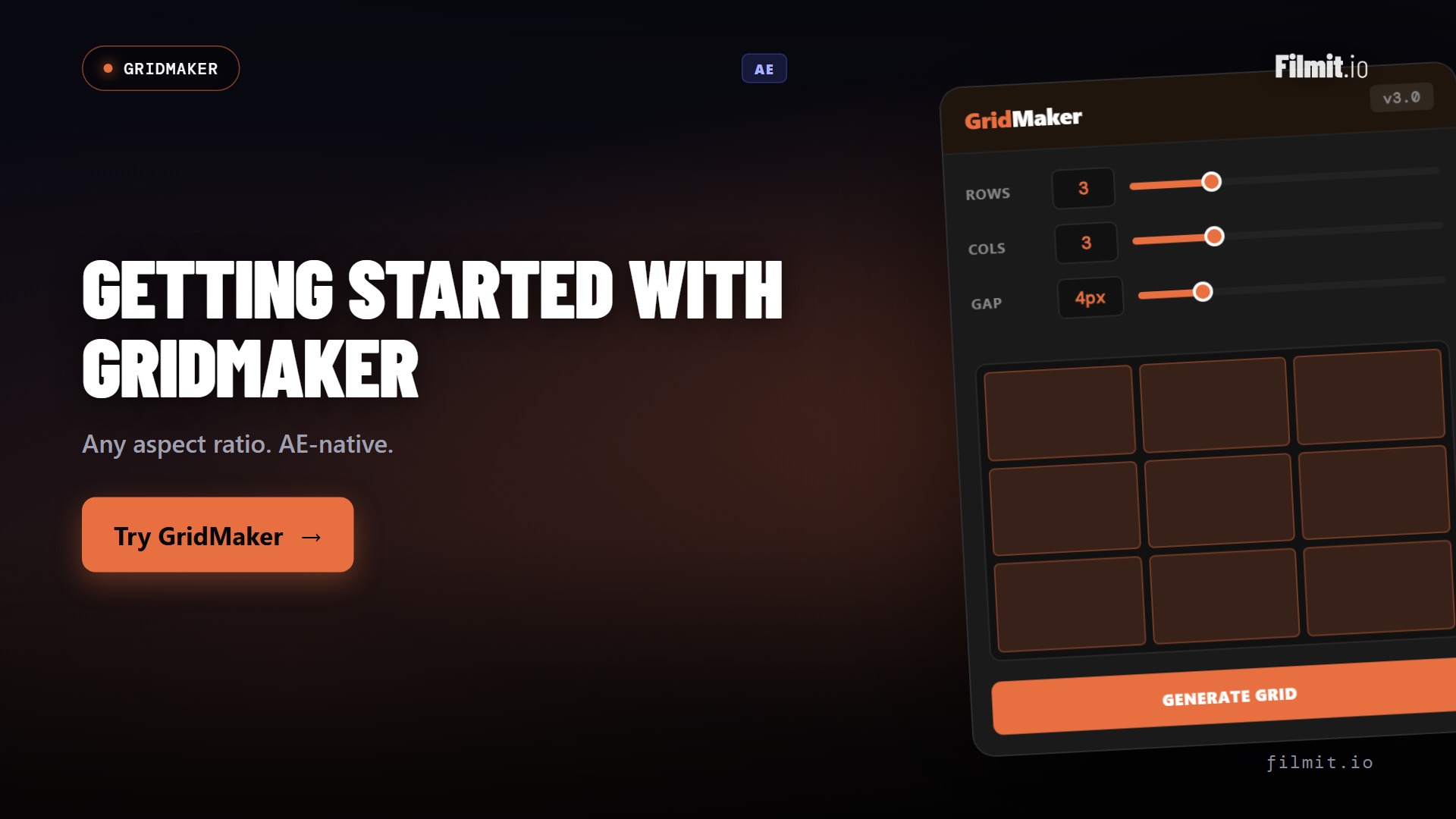
7. Grids and split-screens
Team intros, before-and-after comparisons, multi-product line-ups, regional breakdowns — a clean grid or split-screen organizes information at a glance and lets you show relationships a single full-frame shot cannot. The trick is alignment and breathing room: even spacing, consistent sizing, and enough margin that it reads as designed rather than crammed. Build 2×2 to 12×12 layouts in one click with GridMaker rather than nudging dozens of layers into place manually.
Build a reusable corporate template kit
The thing that separates editors who dread corporate work from the ones who profit from it is templates. Corporate clients come back — quarterly updates, new product launches, the same conference every year — and they expect the same look each time. Rebuilding lower thirds, transitions, and chart styles from scratch on every project is where the hours, and the margin, disappear.
The fix is to build a branded kit once and reuse it. Set up master title and lower-third templates locked to the brand's fonts and colors, a small set of standard transitions, a consistent chart and callout style, and a grid layout for team and product slides. Save them as presets or a template project, and the next deck becomes assembly instead of construction.
This is also where a plugin suite pays for itself. TextPilot updates every title and language version from one panel when the client rebrands; ColorMaster re-skins the whole kit to a new palette in seconds; GridMaker and CallOuts rebuild layouts and annotations in a click. Build the system once, and every future corporate project ships faster and looks more consistent — which is exactly what keeps a corporate client renewing.
The mistakes that make corporate motion graphics look amateur
Four mistakes account for most of the difference between a polished corporate video and a cheesy one. Over-animation — when every element flies, bounces, and spins, the message drowns in movement. Off-brand color and fonts — even small drifts read as careless to the people who own the brand. Slow, showy animations — a three-second logo reveal feels like the viewer is waiting for the content to arrive. And illegible text — type that is too small, too fast, or too low-contrast to read from the back of a boardroom. Fix those four and you are most of the way to professional, before you have touched a single advanced technique.
How to keep it corporate, not cheesy
The fastest way to make a corporate video look amateur is to overdo the motion. Animate openers and key beats; let everything else sit still. Match the motion to the brand's tone — a law firm and a sneaker startup should not move the same way — keep entrances quick (0.2 to 0.4 seconds), and favor subtlety over spectacle. Restraint is not the safe choice; in corporate work, it is the professional one.
A quick corporate workflow, start to finish
Put the seven techniques in order and a corporate deck comes together predictably. Start by locking the script and the brand assets — fonts, exact hex colors, logo files — so nothing drifts later. Build or pull your template kit, then drop in titles and lower thirds first, because text is what changes most and you want it managed from the start.
Next, lay in the structural pieces: section transitions to mark the flow, grids for any comparisons or team slides, and callouts for the moments you need to highlight. Then handle the data — build each chart as a progressive reveal, and double-check every figure against the source. Save kinetic typography for the one or two lines that genuinely deserve it.
Finish with a consistency pass: confirm color is on-brand on every frame, timings are quick and uniform, and text is legible from the back of the room. Watch it once with fresh eyes — or with the sound off — to catch anything that feels busy. Done in that order, the motion supports the message instead of competing with it, which is the whole point of corporate motion graphics.
Build it fast with Filmit
Key takeaways
In corporate work they earn their place by making the message land.
Client revisions and multi-language versions are the real corporate workload — handle them in bulk.
One figure at a time builds trust; off-brand color destroys it.
Animate the key beats, keep entrances quick, and let the rest sit still.
Titles, callouts, grids, color, and transitions in one suite.