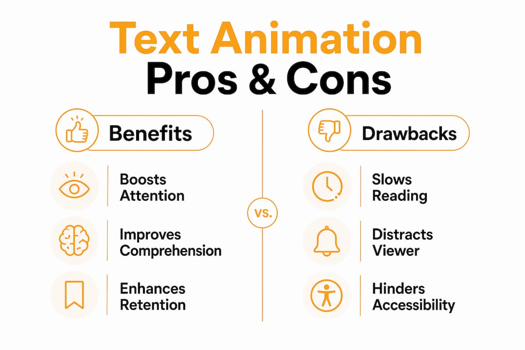
Text animation is the practice of applying motion to typographic elements to direct viewer attention, control reading pace, and reinforce narrative meaning in video content. Every editor working in Adobe Premiere Pro or After Effects has felt the difference between a title card that just sits there and one that snaps into frame with purpose. The role of text animation in engagement goes beyond aesthetics. It exploits a hard-wired human response: the visual cortex prioritizes moving objects over static ones, which means animated text competes for attention on the same neurological level as the footage itself. Used well, it sharpens your message. Used carelessly, it becomes noise.
How text animation controls reading order and message clarity
Kinetic typography is the industry term for animated text that uses motion to communicate meaning, and it is the mechanism behind most effective text animation for engagement in video production. The core principle is sequential revelation: instead of dropping a full sentence on screen at once, you reveal words or phrases in a timed order that mirrors how a speaker delivers them. This gives you editorial control over what the viewer reads first, second, and third.
That control matters most in three specific contexts:
- Headlines and titles: A word that slides in before the rest of the line naturally becomes the anchor. Viewers read it first, which means you can front-load your most important claim.
- Calls to action: A button label or URL that fades in after the supporting copy has settled gives the viewer a moment to absorb the reason before seeing the ask.
- Setup and punchline structures: Revealing the punchline word half a second after the setup phrase creates a beat that feels like live performance. Static text collapses that timing into a single read.
Research confirms that kinetic typography improves comprehension for problem-to-solution and setup-to-punchline structures specifically because the sequential reveal mirrors natural speech rhythm. This means your audience processes the logic of your message rather than scanning it out of order.
The drawback is equally well documented. Kinetic typography applied to long body copy actively hinders reading speed and comfort. When every word arrives on its own schedule, sustained reading becomes exhausting. Reserve motion for short, high-impact text units. Paragraphs belong on static slides or lower thirds, not in an animated word-by-word reveal.

Pro Tip: Animate the first impression of a text element, not the entire duration. A clean entrance animation followed by a static hold gives you the attention-capture of motion without the readability cost.
What text animation presets work best in popular editing tools
Adobe Premiere Pro and After Effects give you the widest range of preset and custom text animations available in any professional editing suite. Knowing which presets serve which purpose saves you from reaching for the wrong tool.
Here is a practical workflow for applying text animations in Adobe Premiere:
- Select your text layer in the timeline and open the dedicated animations window. Adobe Premiere on iPhone and desktop both surface preset options including Fade, Slide, and Rotate as intro and outro effects that control how text enters and exits the frame.
- Apply a Fade for dialogue-adjacent text. Fade animations feel invisible when timed correctly. They work best for lower thirds, speaker names, and caption-style text where you want the content to register without the motion itself drawing attention.
- Use Slide for directional emphasis. A word sliding in from the left implies arrival. From the bottom implies rising importance. Direction carries meaning, so match the slide axis to the emotional tone of the moment.
- Apply Rotate sparingly. Rotation reads as energetic or playful. It fits title sequences and social content but feels jarring in documentary or corporate video where the tone is measured.
- Layer static text with a single animated element. A static headline with one animated word creates contrast that guides the eye without overwhelming the frame. This combination outperforms fully animated text blocks in sustained viewer attention.
Motion graphics professionals working in After Effects have access to far more granular control through the graph editor and expression-driven animations. For editors who want to push beyond presets, bulk text management in After Effects becomes critical when you are animating multiple text layers across a long-form project.
Pro Tip: Treat text animation primarily as a pacing and transition design tool. Intro and outro animations that last 0.2 to 0.4 seconds feel snappy and professional. Anything longer starts to feel like the viewer is waiting for the content to arrive.
Static text vs. animated text: which one serves your story?
The choice between static and animated text is not a matter of preference. It is a structural decision based on what the text needs to do inside the narrative at that specific moment.
Readers control the pace without motion interference.
Sequential reveals slow reading and cause frustration.
Fine for a minimalist aesthetic.
Motion signals a new section and captures attention at the highest-distraction moment.
Works when the design is strong enough to carry the weight alone.
A timed entrance amplifies the emotional beat.
Static captions are easier to read for viewers with motion sensitivity.
Short, subtle animations synced to speech work. Aggressive motion does not.
Works for reference material viewers return to.
Best for first-pass delivery; multimodal beats static text for retention.
The retention data supports animated text in learning contexts specifically. Research shows that immersive text that chunks and reorganizes information produces more positive learning experiences than static equivalents. This means that for YouTube tutorials, course content, and explainer videos, animated text is not decoration. It is a delivery mechanism that affects how much your audience actually retains.
Static text earns its place in long-form content where the viewer needs to read at their own pace, and in accessibility contexts where motion sensitivity is a real concern. The most effective editors use both within the same project, switching between them based on the cognitive demand of each moment.
How to synchronize text animation with viewer attention and narrative timing
Timing is where most editors leave engagement on the table. You can have a beautiful animation that fires at exactly the wrong moment and loses the viewer entirely. The fix is not a faster or slower animation. It is alignment between the text’s appearance and the viewer’s current attention state.
Game developers and UX designers have worked through this problem in detail. Research from LATAM indie developers confirms that placement, style, and timing of animated text directly affect how players and viewers perceive and engage with narrative content. The same principles apply to video.
Practical timing rules that hold across formats:
- Sync text entrance to audio cues. When a word appears on the beat of a music hit or at the end of a spoken sentence, it feels intentional. When it appears mid-phrase, it competes with the audio for cognitive bandwidth.
- Position text away from primary action. Placing animated text over the most visually active part of the frame forces the viewer to choose between the motion in the footage and the motion in the text. Neither wins. Position text in calmer areas of the frame.
- Use subtle cues rather than overbearing effects. Research confirms that animating subtle cues yields better engagement and readability than large, attention-demanding animations. A quick pop or slide registers faster than a spinning entrance.
- Keep entrance moves simple — position, scale, and opacity. These read cleanly at any playback speed and stay predictable on export. Elaborate multi-property moves — warps, per-character physics, heavy blurs — are where timing drifts and the motion starts to feel busy instead of intentional.
- Give text a moment to breathe before the next cut. An animated text element that cuts away before the viewer finishes reading it creates frustration, not engagement. Hold for at least one second after the animation completes before cutting.
Short, timed text animations aligned with speech improve caption readability and viewer attention more than aggressive bouncing or spinning animations. The motion characteristics of kinetic typography also communicate emotional qualities that complement the meaning of the words themselves. A slow fade reads as reflective. A sharp slide reads as decisive. You are not just moving text. You are adding a layer of meaning that the words alone cannot carry.
Key takeaways
Text animation captures attention and guides comprehension when applied to short, high-impact text units at precisely timed moments in the narrative.
Animate text entrance to guide viewers through setup-to-punchline or problem-to-solution structures.
Fade for subtlety, Slide for direction, Rotate for energy. Mismatched styles undercut the message.
Reserve static text for body copy, captions, and anywhere the viewer needs to read at their own pace.
Sync text entrance to audio cues and keep text away from high-motion areas of the frame.
Brief, transform-and-opacity animations beat large, complex effects for engagement and readability.
The hard part of text animation isn't the animation
On the creative side, restraint usually wins. Beginners reach for the most dramatic preset in the library; the editors whose work holds up reach for the most invisible one. Spectacle catches the eye once — subtle, well-timed motion keeps the viewer in the story, and it ages far better. So animate your openers and your key emotional beats, and let everything else sit still. Test your timings with the sound off: if the text feels rushed in silence, it will feel rushed with audio too.
But the craft is maybe ten percent of the job. In real client work the text is never finished — it comes back with revisions, font changes, a second and third language, all of which have to stay consistent across every comp. Learning to animate text well matters. Building a system that can absorb those changes without burning you out matters more.
I've owned a commercial production company and seen hundreds of reels. The hard part of text was never the animation — it's the fortieth revision, the font swap, the third language, all kept consistent. Anyone can animate a headline; building a system that handles the changes without burning you out is the real skill.
—max
Speed up your text animation workflow with Filmit

Building polished text animations from scratch in every project burns time you could spend on the creative decisions that actually matter. Filmit builds productivity plugins for Adobe Premiere Pro and After Effects that automate the repetitive parts of motion graphics work, including text animation setup, preset management, and layer organization. Whether you are a solo YouTuber building a title sequence or a post-production agency managing dozens of projects, Filmit’s editor tools give you a faster path from rough cut to finished motion. Motion designers working in After Effects can explore AE-specific plugins built for mograph workflows where text animation complexity runs deep. Every tool installs through Filmit Studio, the free companion app for Windows and macOS.