A motion graphics explainer is an animated video that moves graphic design elements, such as text, shapes, icons, and UI components, to communicate information clearly and quickly. The industry term is “motion graphics explainer video,” and it sits at the intersection of graphic design, animation timing, and filmmaking pacing. Unlike character-driven animation, every frame serves a communication goal. Tools like Adobe After Effects power the vast majority of professional production. If you’ve ever watched a SaaS product walkthrough or a kinetic typography ad, you’ve already seen what a motion graphics explainer does at its best.
What is a motion graphics explainer video, exactly?
A motion graphics explainer is defined as animated graphic design elements, including text, shapes, icons, and UI components, set into purposeful motion to clarify information rather than tell character-led stories. Every movement has a reason. Nothing animates just because it looks cool.
The core building blocks of a motion graphics explainer include:
- Kinetic typography: Words that move, scale, or fade to reinforce spoken or written messages
- Animated icons and shapes: Simple geometric forms that guide the eye through a concept step by step
- Infographic sequences: Charts, data visualizations, and diagrams that build on screen in real time
- Logo animations: Brand marks that enter, hold, and exit with purpose
- UI walkthroughs: Screen recordings layered with callouts and highlight animations
The motion graphics definition separates this format from traditional character animation. Character animation uses acting, narrative arcs, and emotional performance. Motion graphics use design set in motion to support a message. The two share principles like timing and easing, but they serve entirely different functions.
Intentionality is the defining quality. Professional motion graphics guide the viewer’s eye and tell them what to prioritize. Non-professional work animates elements arbitrarily and confuses the viewer. That single distinction often separates a rushed freelance job from a polished studio deliverable.

How do motion graphics explainers work? The production workflow
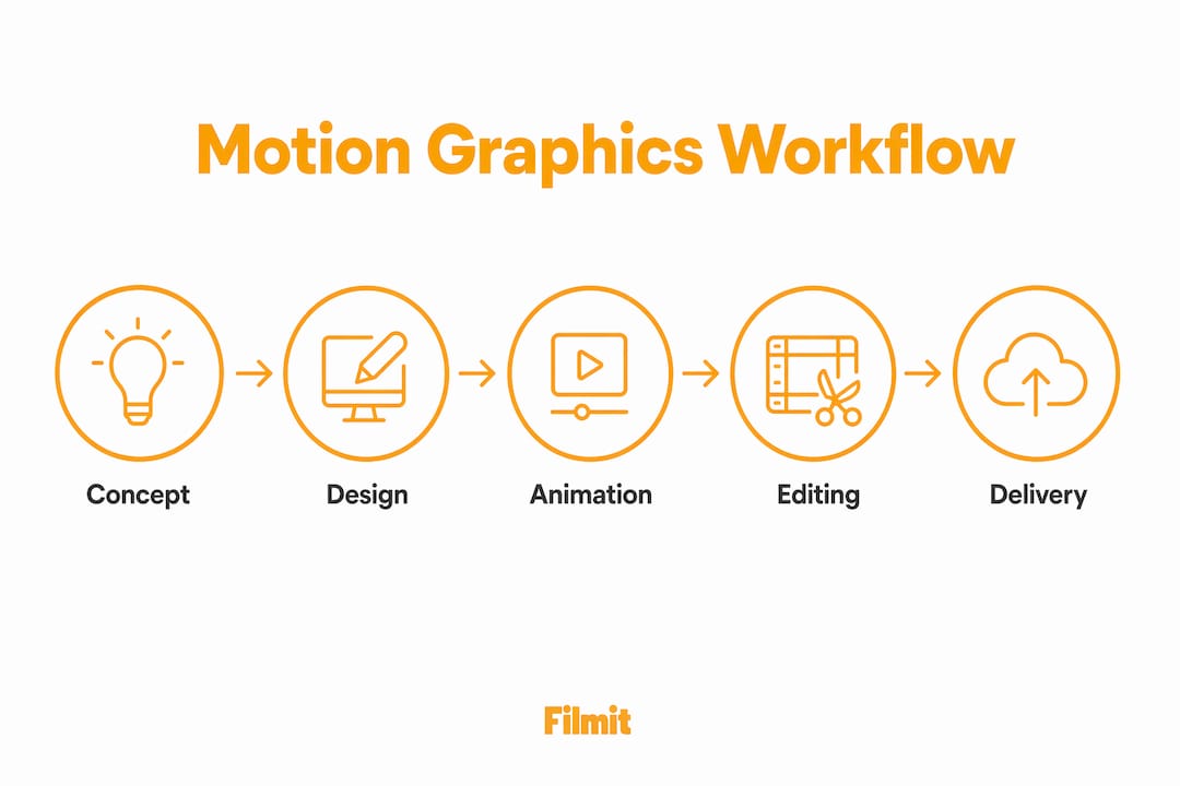
The creation process follows four professional stages. Understanding each one helps you brief a designer, evaluate a quote, or build the skill yourself.
Design static assets and your visual language
Before a single keyframe is set, build every graphic element in its resting state: color palette, typography, icon style, and layout grid. Establishing the visual language first makes revisions faster and keeps the project consistent from start to finish.
Define movement with keyframes
A keyframe marks the state of an element at a specific point in time. Set one at the start position and another at the end, and After Effects calculates everything in between. This is where the explainer comes to life.
Apply easing curves for natural motion
Raw keyframe interpolation produces robotic movement. Adding ease in and ease out, so an element accelerates from rest and slows into its destination, is the single biggest upgrade a beginner can make. Professional motion often uses steep custom curves that snap quickly then settle, giving animation energy and weight.
Sync audio and visual timing
Sound design and voiceover are not afterthoughts. Dynamic pacing and sound synchronization carry the experience without characters or plot. A word that appears exactly on a beat lands harder than one that drifts in half a second late.
Pro Tip: Build your After Effects project with pre-composed layers named by function, not by default names like “Shape Layer 47.” Clean project structure cuts revision time significantly, especially when a client asks you to change the color of every callout box at the last minute.
For a deeper look at structuring your Adobe After Effects sessions, the After Effects workflow guide on the Filmit blog covers project organization from comp setup to final export.
What are the real benefits of motion graphics explainers for businesses?
Motion graphics explainers improve content retention and simplify complex concepts, making them the preferred format for SaaS onboarding, product walkthroughs, and ad hooks where clarity matters more than plot. That preference is not arbitrary. When you need a viewer to understand a multi-step software feature in under 90 seconds, a motion graphics explainer does the job faster than a live-action video or a static slide deck.
The practical benefits stack up quickly:
- Faster comprehension: Animated visuals and synchronized narration hit two cognitive channels at once, reducing the mental effort required to understand a new concept.
- Higher brand recall: Motion and sound together create stronger memory anchors than static images alone.
- Platform flexibility: A motion graphics explainer exports cleanly to YouTube, LinkedIn, a website hero section, or a trade show screen without reshooting.
- Cost efficiency over time: Once your visual language is built, producing additional explainer videos in the same style costs a fraction of the original investment.
- Accessibility: Captions, translated voiceovers, and on-screen text make motion graphics explainers easier to localize than live-action content.
The importance of motion graphics extends beyond marketing. Internal training videos, investor pitch decks, and product documentation all benefit from the same format. A well-built explainer video for a SaaS onboarding flow can reduce support ticket volume by replacing written documentation that users skip. For animated infographic techniques that work directly in Premiere Pro, the Filmit guide on animated infographics is worth bookmarking.
How do motion graphics explainers compare with GIFs, character animation, and live action?
Each format has a specific job. Choosing the wrong one wastes budget and dilutes your message.
The biggest difference between a GIF and a motion graphic is that motion graphics achieve more fluid and advanced animations, while GIFs support only simple looping sequences. GIFs compress heavily and lose quality at larger sizes. A motion graphics explainer rendered at 1080p holds its visual quality across any screen.
Motion graphics are design set in motion; character animation is acting through drawing. The two overlap in tools and timing principles, but a motion graphics explainer does not need a protagonist. It needs a clear message and a viewer who leaves knowing something they did not know before.
Live action brings authenticity but locks you into a physical shoot. Reshooting a product demo after a UI update costs real money. A motion graphics explainer updates in After Effects in an afternoon.
What are the best practices and common pitfalls in motion graphics production?
The most common mistake in motion graphics production is over-animation. Beginners animate every element simultaneously because it feels dynamic. The result looks cheap and exhausting to watch.
Professionals follow the rule of restraint: animate only the entry, emphasis, and exit of each graphic element. When one thing moves at a time, the viewer knows exactly where to look. When everything moves at once, the viewer looks nowhere useful.
Avoid these specific pitfalls:
- Skipping the static design phase. Jumping straight into After Effects before your visual language is defined produces inconsistent results and forces expensive rework.
- Ignoring context. Review your motion graphics within the full video before delivery. A graphic that looks beautiful in isolation can overpower a voiceover or clash with a background when placed in the full sequence.
- Neglecting easing. Linear keyframes are the clearest signal of amateur work. Apply custom easing curves to every animated element, every time.
- Mismatching audio and visual timing. If your text appears a beat after the narrator says the word, the viewer notices. Sync matters more than most beginners realize.
Pro Tip: Use After Effects’ Graph Editor, not just the default Easy Ease button. The Graph Editor lets you sculpt the exact acceleration curve for each element, giving you the kind of snappy, weighted motion you see in high-end motion graphics video examples from studios like Buck or Oddfellows.
For callout animation techniques that apply these principles directly, the Filmit resource on callout animation examples shows how restraint and timing work together in real explainer projects.
Key Takeaways
A motion graphics explainer is defined by purposeful motion: every animated element must guide the viewer’s attention, not decorate the screen.
Motion graphics explainers move text, shapes, and icons to communicate information, not to tell character-driven stories.
Design static assets, set keyframes, apply easing curves, then sync audio and visuals for a cohesive result.
Custom easing curves are the single biggest quality upgrade, turning robotic movement into natural, weighted motion.
Animate only entry, emphasis, and exit per element. Everything moving at once is the hallmark of amateur work.
Motion graphics explainers reduce comprehension time, improve brand recall, and update faster than live-action alternatives.
Motion graphics in 2026: what actually matters
Most businesses treat motion graphics explainers as a production task. Brief a designer, approve the video, post it, move on. That approach misses the real opportunity.
Motion graphics are a communication design layer. The best explainer videos we have seen do not just look good, they restructure how a viewer understands a product or idea. The motion itself carries meaning. An icon that slides in from the left implies sequence. A shape that pulses implies urgency. Treat animation as decoration and you waste that signal entirely.
The trend worth watching in 2026 is the integration of motion graphics with interactive and audio-reactive elements. Static explainer videos are giving way to formats where the animation responds to user input or adapts to platform context. That shift rewards creators who already understand the fundamentals of timing, easing, and intentional motion, because those principles do not change regardless of the delivery format.
The honest advice for businesses adopting motion graphics: invest in the visual language first. A consistent style guide for your animated elements, including caption style, callout design, and transition behavior, pays back every time you produce a new video. Without it, each new explainer looks like it came from a different company.
Clarity beats complexity every time. The most effective explainer we have reviewed was under 60 seconds, used three colors, and animated exactly four elements. It converted better than a two-minute production with a full voiceover cast. Restraint is not a budget limitation, it is a design decision.
Build explainers faster with Filmit
Once you understand the workflow, the slow part of explainer production is rarely the creative decisions, it is the mechanical setup: building callouts, naming and organizing comps, keeping visual treatments consistent across a project. We build After Effects and Premiere Pro plugins for exactly that, with CallOuts for annotation animations and Organizer for the project structure this guide keeps pointing back to, so your time goes to the easing and timing that actually make the work stand out. Everything installs through Filmit Studio, our free companion app for Windows and macOS. Explore Filmit for motion designers to see the full toolkit.