Caped Vigilante
Caped Vigilante LUTs
Batman-Inspired Comic-Book Contrast and Saturation
Inspired by Batman
Comic-book contrast, saturated primaries, punchy midtones.
The Look
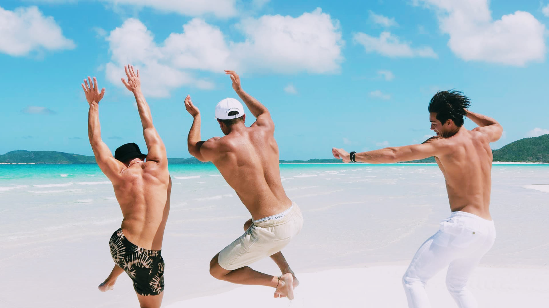
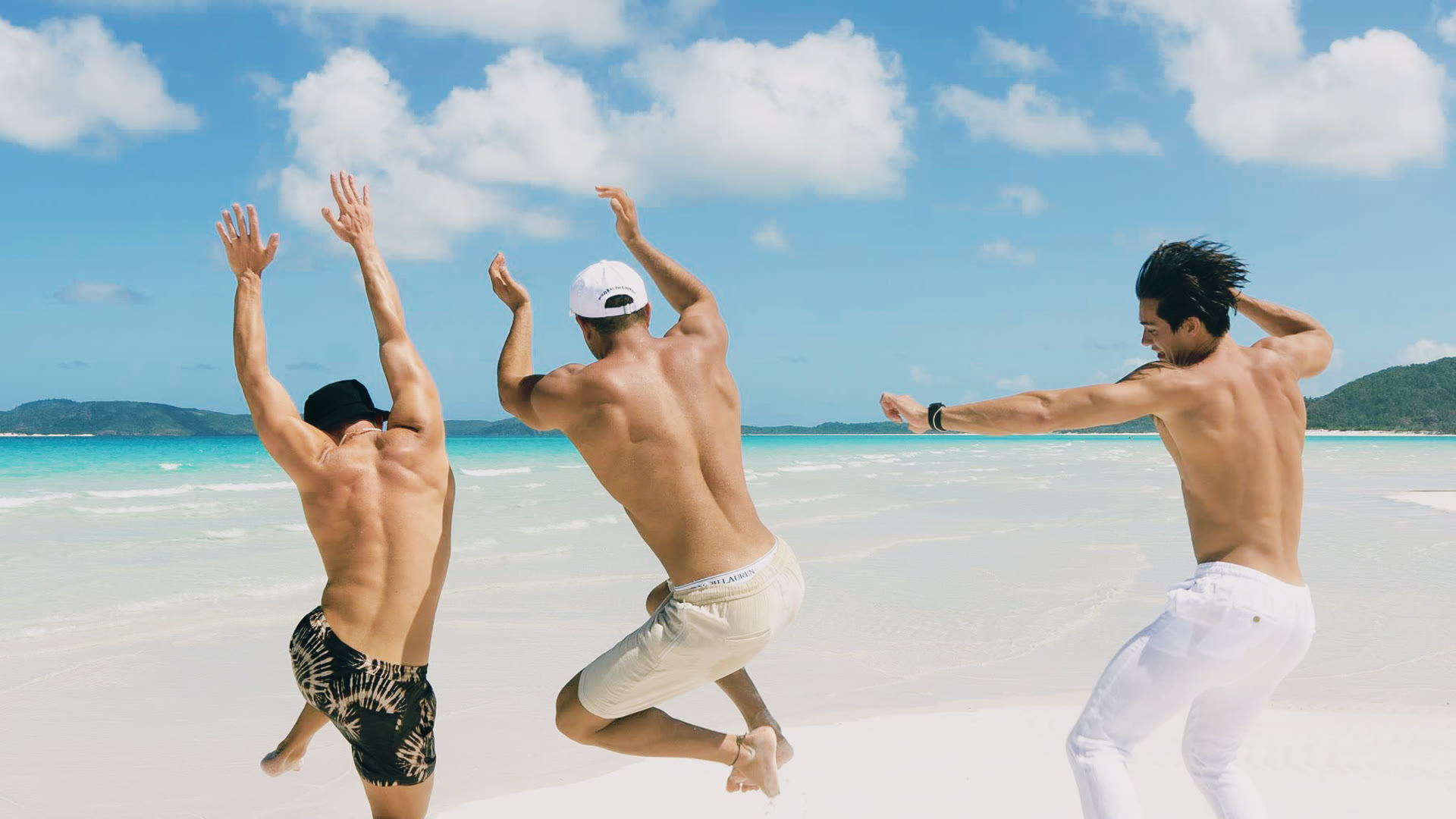
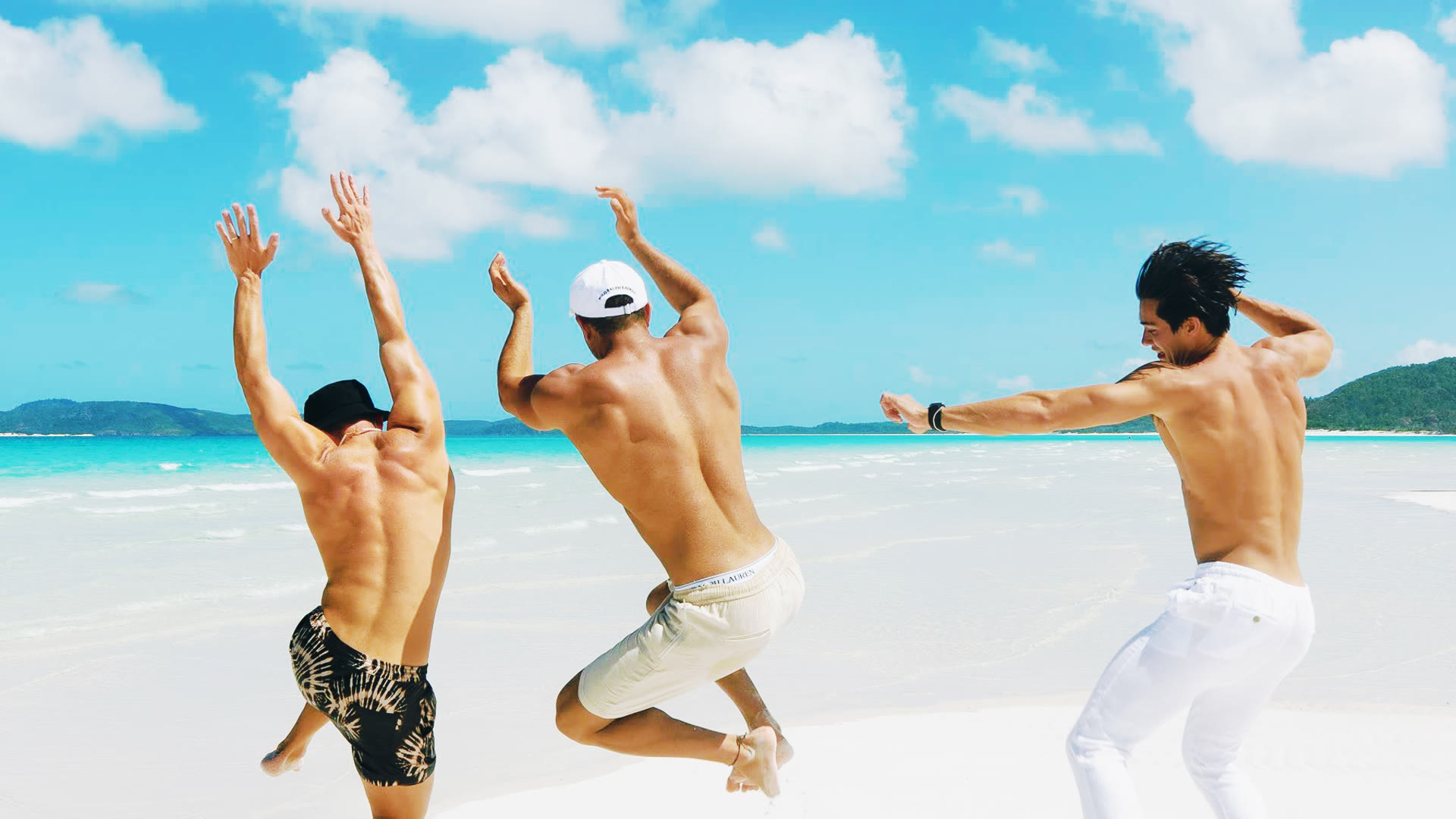
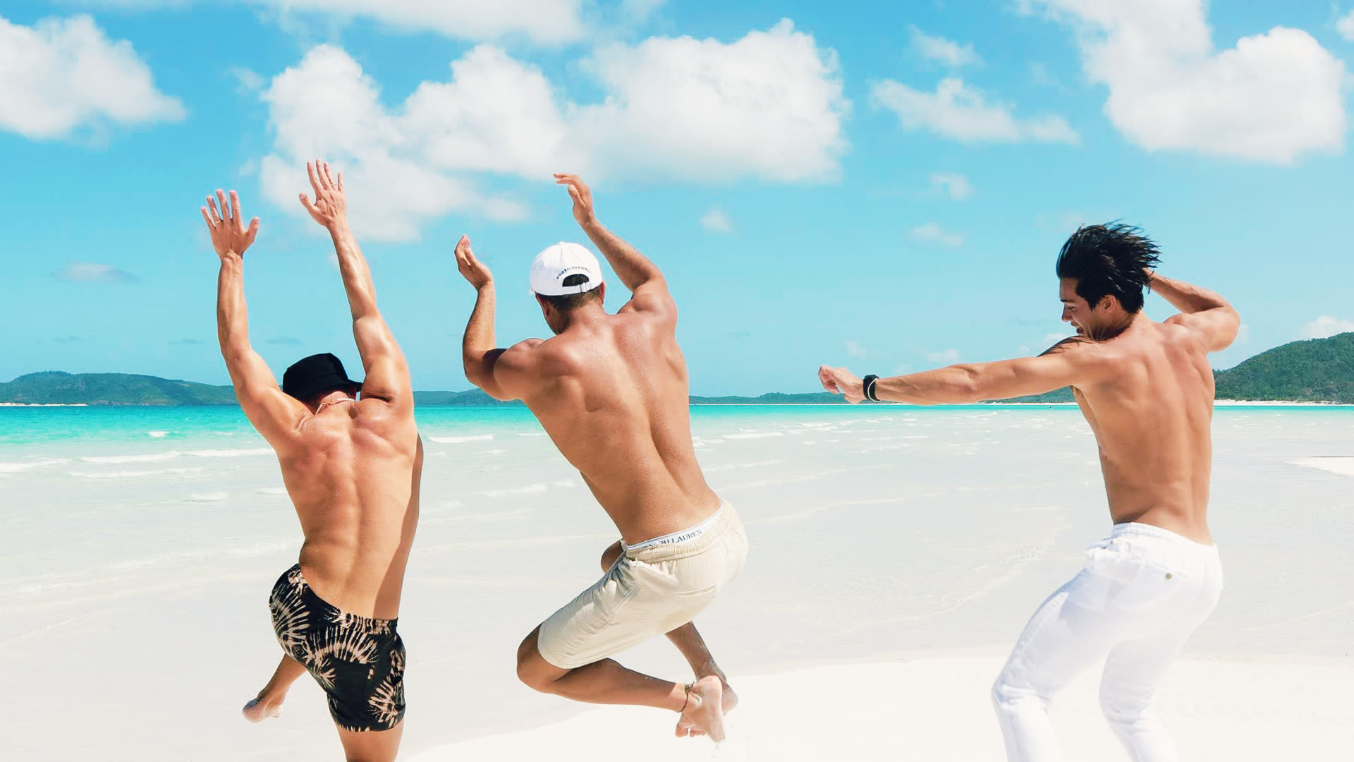
Caped Vigilante is the comic-book superhero grade in its classic form. The pack pushes primaries hard, holds contrast above natural, and warms midtones to give faces the heroic glow that comic-page art has used since the 1940s. Saturation cranks especially on blues and reds, the two colors most associated with cape-and-cowl iconography. This is not a subtle grade. It is built for projects that lean into the comic-book heritage rather than trying to escape it.
Inspired by Batman
Tim Burton's Batman (1989) established the visual template for the modern superhero film: gothic shadows balanced against pop-saturated primaries, with Anton Furst's Gotham production design giving the grade something to push against. The comic-book contrast vocabulary has run through every Batman film since, evolved by Schumacher's neon excess, refined by Nolan's grounded approach, and modernized by Reeves's noir treatment.
Best For
- Superhero and comic-book inspired narrative work
- Action shorts and trailers with theatrical direction
- Cosplay and convention content
- Music videos with comic or graphic-novel aesthetics
- Fan films and homage projects
Color Notes
The blue and red push can clip if your footage has heavy primary content. Watch your vectorscope; pull saturation back 5 to 10 percent if shots are blowing out. The matte variants hold up better in mixed lighting; the punchy variants are for stylized interiors.